Last year, the smartphone that garnered huge hype was not from Samsung or Apple. Surprisingly, it was from a new player called NOTHING. Helmed by former OnePlus founder Carl Pei, the company released the phone (1) which drew people in with its Glyph interface gimmick and minimalist design. One designer was inspired to share a concept follow-up called the Mini Phone.
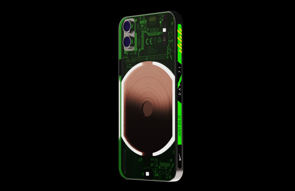
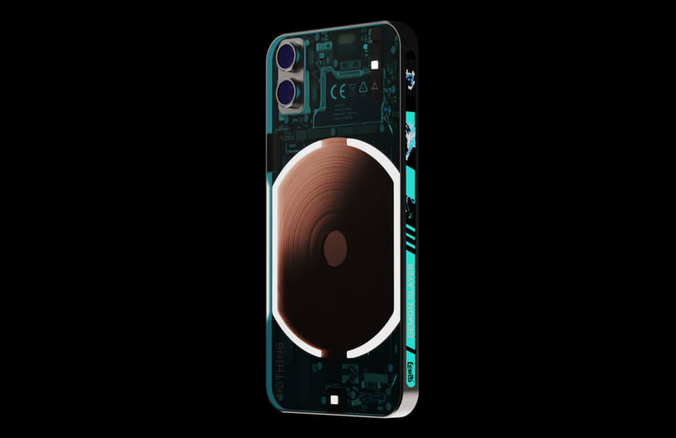
The products from NOTHING – the phone (1), ear (1), and ear (stick) – all follow a transparent aesthetic. In fact, this approach appeals to tech-savvy consumers who have a fascination with the inner workings of their devices. Thus, Priyanshu Jaiswal is not about to deviate from the established cosmetic theme with the Mini Phone.
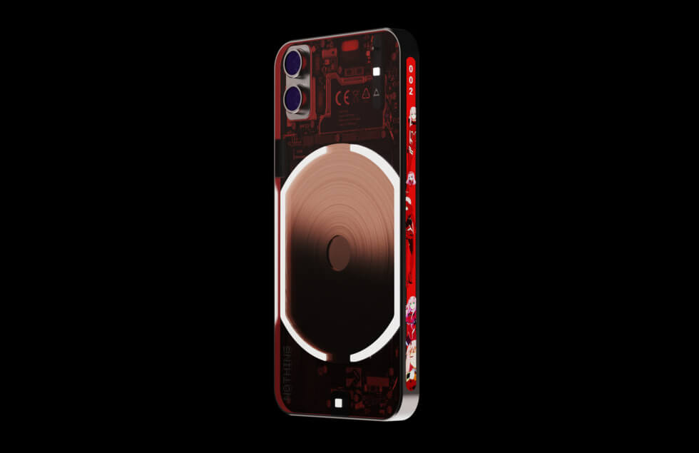
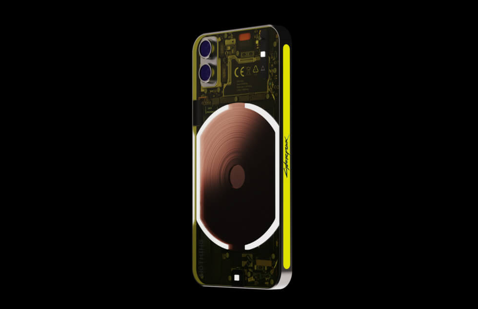
We must say that this proposed take on the next model from the manufacturer looks cool. As the name says, it’s likely to be smaller than the phone (1). However, there are some nifty features you won’t find on the original. Starting off with the design, the form factor and see-through elements are all intact.
Its construction uses a textured metal frame and matte glass. The Glyph interface on the Mini Phone receives a revamp that adds a vertical display on the left flank. This is a customizable screen that can show charging animations, battery levels, and more.
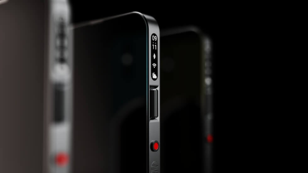
Next is another vertical display on the upper right frame which functions like Apple’s Dynamic Island on the iPhone 14 Pro and iPhone 14 Pro Max. Still on the right flank is a vertical scroll roller which replaces the traditional volume rocker. It also allows users to navigate specific apps for convenience. The Mini Phone also comes with a physical camera shutter button.
Discover More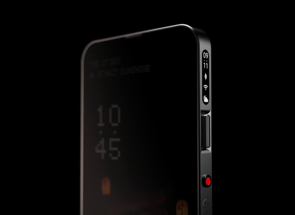
Images courtesy of Priyanshu Jaiswal


