When building something, architects and engineers generally follow a symmetrical design. Not only does it look good, but it also balances out the load. Although there are attempts to showcase the bold beauty of asymmetry, it’s harder to pull off in some cases like that on a ship. Nevertheless, the 61 Asymmetric manages to do the unthinkable.
This 200-foot vessel is hardly the first to hit the waters with an uneven theme throughout its blueprint. However, Francesco Struglia Design presents a concept that only reveals its namesake from certain angles. Even when you spot the odd outline of the superstructure, it’s not jarring enough to take away from its striking profile.
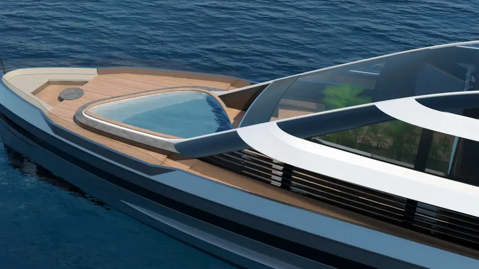
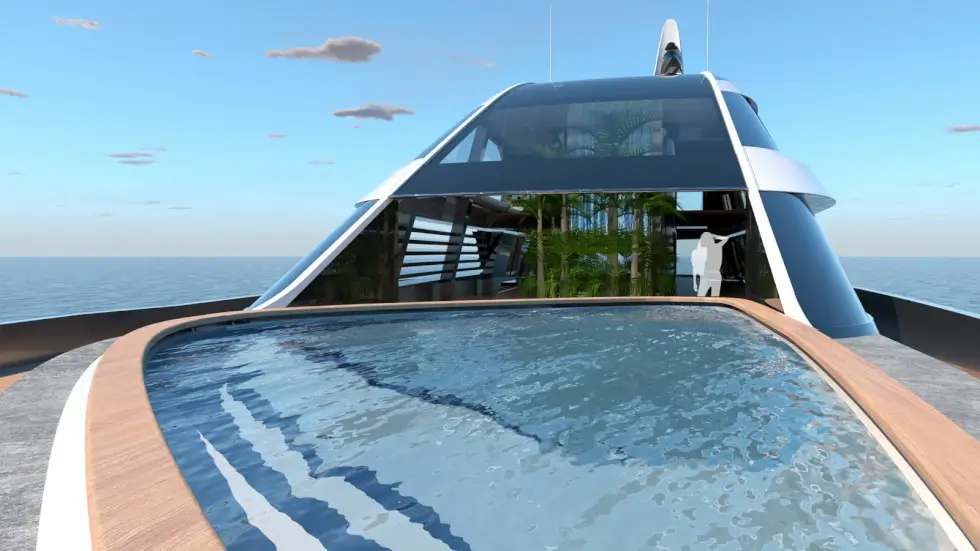
In fact, people know what 61 Asymmetric is all about, it looks just like any sleek and contemporary superyacht. While most recreational ships prefer to position their pools toward the aft close to the beach club, the studio opts to mix it up instead. Hence, those who fancy a dip can head over to the foredeck.
Francesco Struglia Design notes that the interior volume should be around 1,000 GT given its 34-foot beam. It is estimated to feature accommodations for up to 12 guests and also houses a crew of 10 to man its stations. The 61 Asymmetric provides ample social spaces outside as well as within.
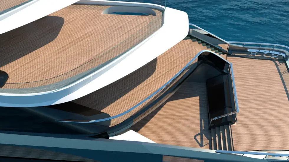
Currently, the renders of the ship offer a general overview of how the decks would appear when symmetry is optional. To provide uninterrupted views of its surroundings, the wheelhouse is located at the topmost level of the 61 Asymmetric. Depending on the client, the team can turn the double-level area into a greenhouse, lounge, or whatever they want.
Discover More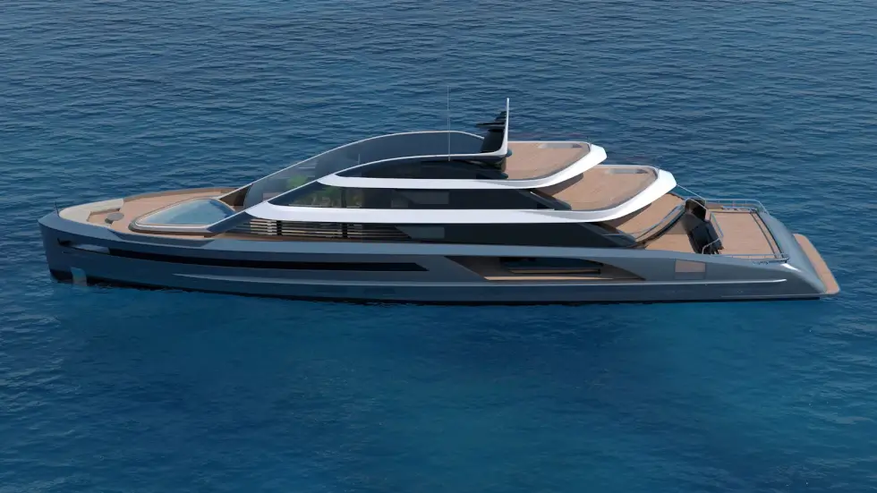
Images courtesy of Francesco Struglia Design


