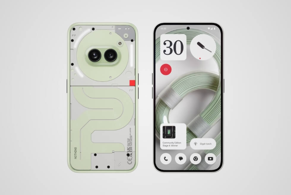
Nothing stoked people’s nostalgia for a distinct aesthetic from the bygone days. The group may not be the first tech company to retail electronics with transparent cases but considers it a signature theme. Its latest release — the Community Edition variant of the Phone (2a) Plus — is remarkable for several reasons. Moreover, the device is a wonderful project that values user input.
As consumers, we generally have low expectations when it comes to how manufacturers perceive feedback. A common practice among the biggest names in the industry with legions of loyal fans is social media engagement. Negative comments are usually moderated to maintain a positive image, while replies are mostly generic and vague.
In short, these tech titans only want your money and render any criticism by its customers moot. Headed by Carl Pei — co-founder of OnePlus, many perceive the brand as a rebel in a saturated market of Android OEMs. In fact, its release of the Phone (2a) Plus Community Edition hints at a lucrative and game-changing approach for future products.
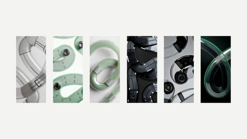
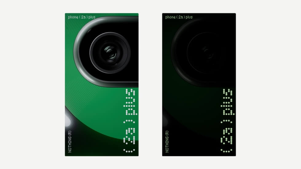
This handset is the result of a massive undertaking by Nothing to collate over a thousand suggestions from 47 countries. It took approximately six months to narrow down all submissions and come up with the final details. After four stages: Hardware Design, Wallpaper Design, Packaging Design, and Marketing Campaign, the Phone (2a) Plus Community Edition comes to life.
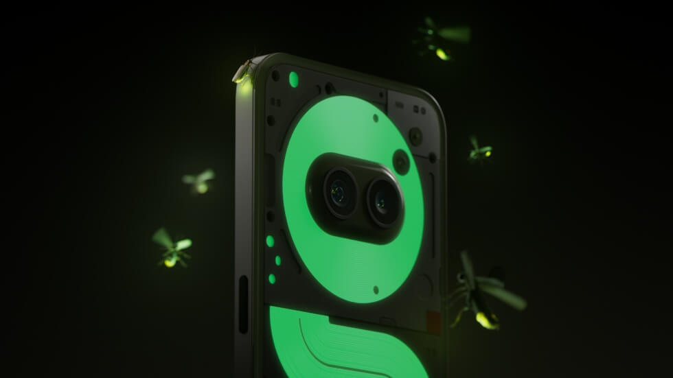
Specifications-wise, the smartphone matches that of the standard Phone (2a) Plus. In addition to the intuitive Glyph Interface, the see-through back panel also features a phosphorescent graphic element. The Community Edition ships with unique wallpapers and in exclusive packaging. Only 1,000 units are available for purchase with priority given to Nothing community members.
Learn More


Images courtesy of Nothing

