Direct engagement with consumers is often a great way for companies to build rapport. Unfortunately, there are also caveats to consider, which can lead to negative experiences. Nonetheless, Nothing seems to have nailed it down perfectly with its Community Edition Phone series. This time, it’s the (3a) model that welcomes concept submissions like the Carpe Diem.
If you were following this initiative at the get-go, the Phone (2a) Plus Community Edition was a smash hit. Given the production run was extremely limited, reports reveal that all allocations quickly sold out in 15 minutes. As for the unique selling point, the device flaunts a phosphorescent green back cover design.
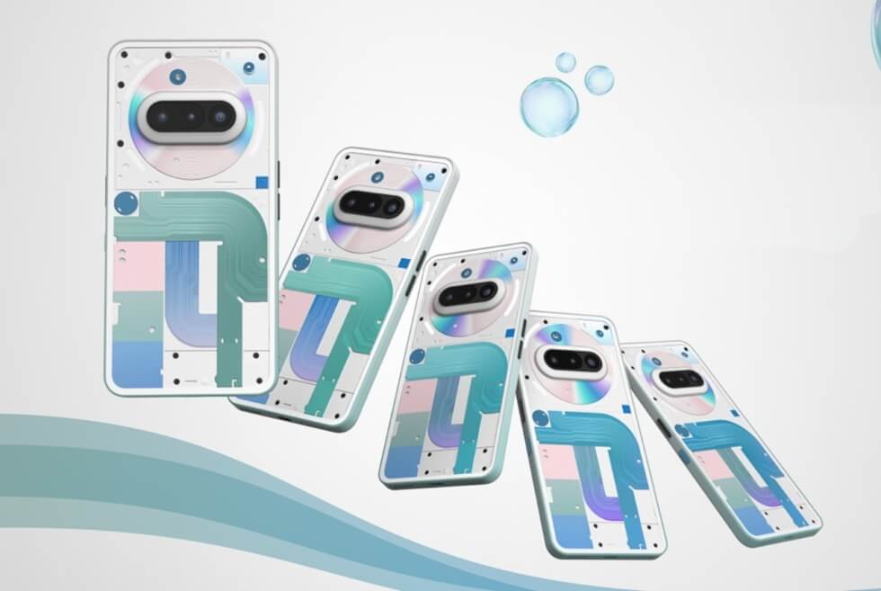
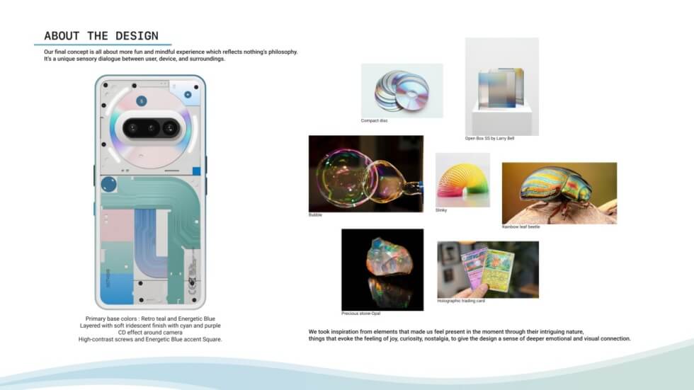
Among the wave of entries for the Nothing Phone (3a) Community Edition, the one from designers Vivek Mahajan and Naorem Arlex caught our attention. They are calling it the Carpe Diem, along with the slogan “feel the moment” to convey a “mindful experience.”
To set it apart from the standard black, white, and blue, we have a mesmerizing iridescent finish. Moreover, the lower left corner of the transparent rear panels shows three thermochromic blocks. With light usage and normal temperature, these appear in light shades of green, blue, and pink.
As the components heat up, the tone dynamically shifts and doubles as an indicator of heavy usage. Apart from its gradient colors, the Glyph Interface is intact for notifications and such. The Nothing Phone (3a) Community Edition Carpe Diem concept is purely aesthetic. This means all technical specifications will follow the commercial release units.
Discover More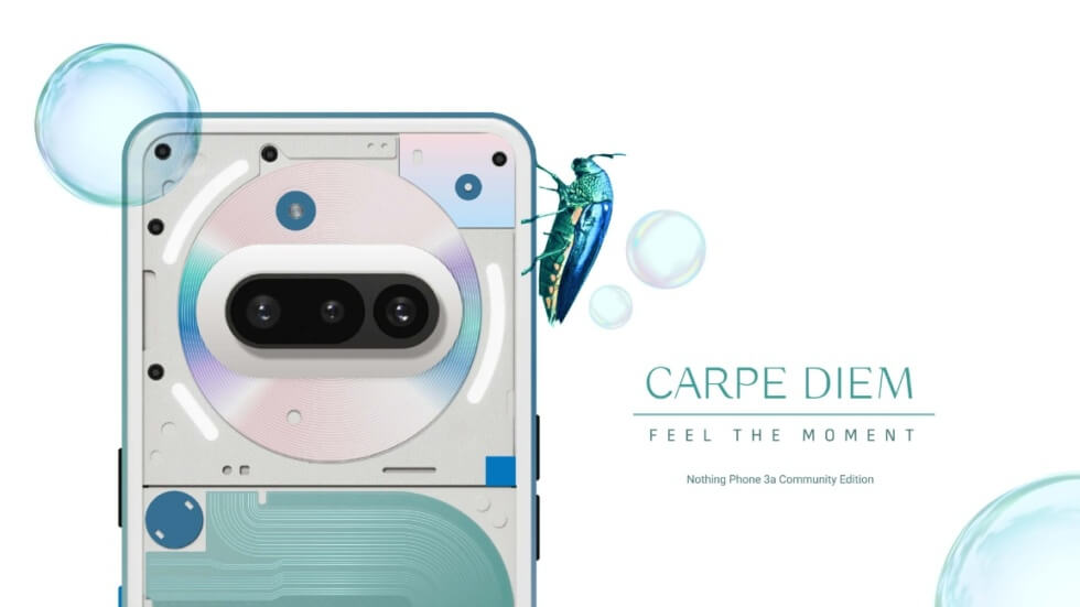

Images courtesy of Vivek Mahajan/Naorem Arlex/Nothing