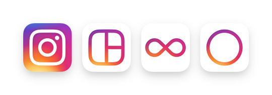
Instagram has released a new update for both its iOS and Android users. The new update brings with it a new design and a new modern colorful logo.
Although Instagram had already updated their apps with the new black and white design for some, now it’s made it official.
All users will now get the new look, which puts more emphasis on the photos and videos. How does it do that? Well, the only colors you’ll see in the new Instagram app is on the photos and videos, everything else is now black and white.
Apart from that, the Facebook owned company have also changed their logo. Instagram says that the new logo, which is simpler and colorful, was inspired by the original. The camera is still present in the logo, after all, that is the essence of the app.
The logo was chosen from a lot of several other ones, which didn’t make the cut. Here’s a video showing how they made the new logo;
https://player.vimeo.com/video/166138104″ align=”center” maxwidth=”849
Their other apps such as Layout, Hyperlapse and Boomerang have also received icon redesigns.

Within the Instagram app, the design has changed, but everything else remains the same. The navigation is like it used to be, there’s no new way of doing things, etc. The only thing that’s different is the color.
Instagram is the number one mobile photo sharing app as of now. The company boasts over 80 million photos and videos shared every day. That’s a lot of content. Over the years, Instagram hasn’t changed much in terms of design and functionality. The core aspect remains the same, which is good.
The new design and the icon are part of a new update, which is currently rolling out to all iOS and Android users. Have you received the update yet? How do you like the new logo? Do you prefer the new logo or the old one?
