The square instant camera with the tiny rainbow that we all got so used to seeing on Instagram has now been replaced with the new Instagram logo that was unveiled recently.
Instagram Logo and Design Changes
The new Instagram logo is a purple, orange and pink icon and bears no resemblance to the former instantly recognisable skeuomorphic logo that was a representation of the iconic Polaroid camera.
The old Instagram logo was one of the most universally loved tech logos.
Instagram’s supporting apps – Boomerang, Hyperlapse and Layout have also been redesigned using the same color scheme as the logo. The background and menus are now entirely in black and white.
The new design is muted to give more prominence to photos.
There are no changes to the working of the Instagram app.
Instagram said that this design change reflects the transformation the app underwent over the years.
The Original Instagram App
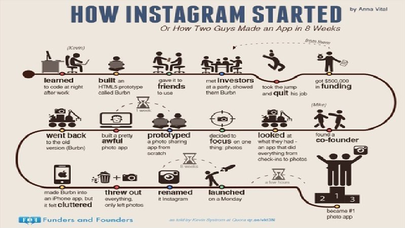
“Burbn” as the original app was called, first became popular for its photo filters and effects that created images with a retro edge. Due to this, it was common practice for users to take their photos from Instagram and use them at other social networking sites like Facebook and Twitter.
But today, Instagram made massive strides and the app now boasts of more than 400 million users.
Having turned into a major social phenomenon, Instagram now felt the need to reflect the growth and felt the previous logo was dated.
It was “beginning to feel, well… not reflective of the community, and we thought we could make it better,” writes Ian Spalter, Instagram’s head of design.
A spokesman said, “We’ve been inspired by all the ways the community has grown and changed, and we wanted to create something that reflects how vibrant and diverse storytelling on Instagram has become.”
Instagram Users’ Reaction to the New Logo
While people use words like “Travesty” to describe the new Instagram logo and Twitter is all abuzz with Instagram’s big change, particularly with the choice of gradient and colors; Cole Rise, the designer of the previous logo, far from being disappointed seeing his creation tossed aside, says he likes the new logo.
Rise attributes people’s panic to the standard hand-wringing that’s bound to happen whenever a major product or service changes.
According to Rise, “It’s kind of like the Uber redesign — people freaked out, and now it’s totally fine. Change can be hard, and people will have to adjust to it, but I think people will love the new stuff once they get used to it on their home screens.”
“I’m super psyched on the new one,” Rise says. “I love the minimalism. Regardless of the colors behind it, the white shape — the actual bones of the new symbol itself — is beautiful, and I think that can persist over time.”
Rise happens to be a friend of Robert Padbury, one of the designers of the new Instagram logo, who was also involved in Uber’s revamp earlier this year as well as Apple’s major shift to flat design in iOS 7.
The new Instagram logo and other design changes have been updated on iOS and Android apps on Wednesday.
What do you think of the new Instagram logo? If you ask me, I’m not a fan.